CLIENT Hansa Estetik (2024)
WORK AREAS Web design, UX/UI, Visual identity
SOFTWARE Figma, Adobe Illustrator, Squarespace, Hotjar, Google Analytics, Google Search Console
Which style mirrors a young hybrid clinic in the heart of Malmö best? – Modern Scandinavian, of course!
Hansa Estetik, located in Malmö’s iconic Hansa shopping center, is a modern hybrid clinic, combining dental care with aesthetic beauty treatments, that beautifully reflects the elegance of its surroundings. Drawing inspiration from the history of the space, once home to the renowned Nordiska Kompaniet, the design aims to complement the building’s character while introducing a contemporary flair.
My task was to create a seamless, minimalistic user experience (UX) paired with a modern yet sophisticated user interface (UI). It was essential to emphasize the clinic’s core values: honesty, authenticity, genuineness, and transparency.
After conducting research, customer interviews, and a mini-workshop with the client, I identified three primary needs: a clear call-to-action for booking appointments, a quick overview of treatments, and a Q&A page to streamline the clinic's operations.
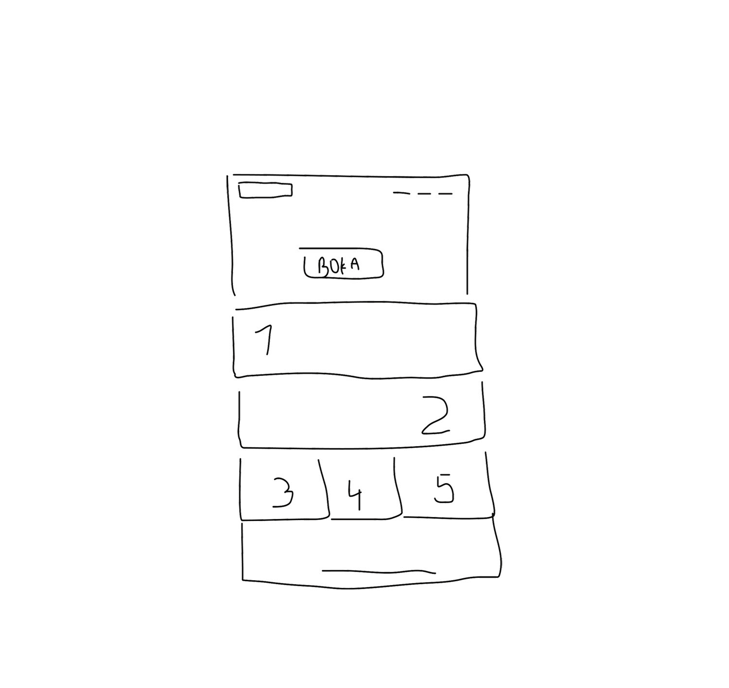
A first scribbled draft of the landing page
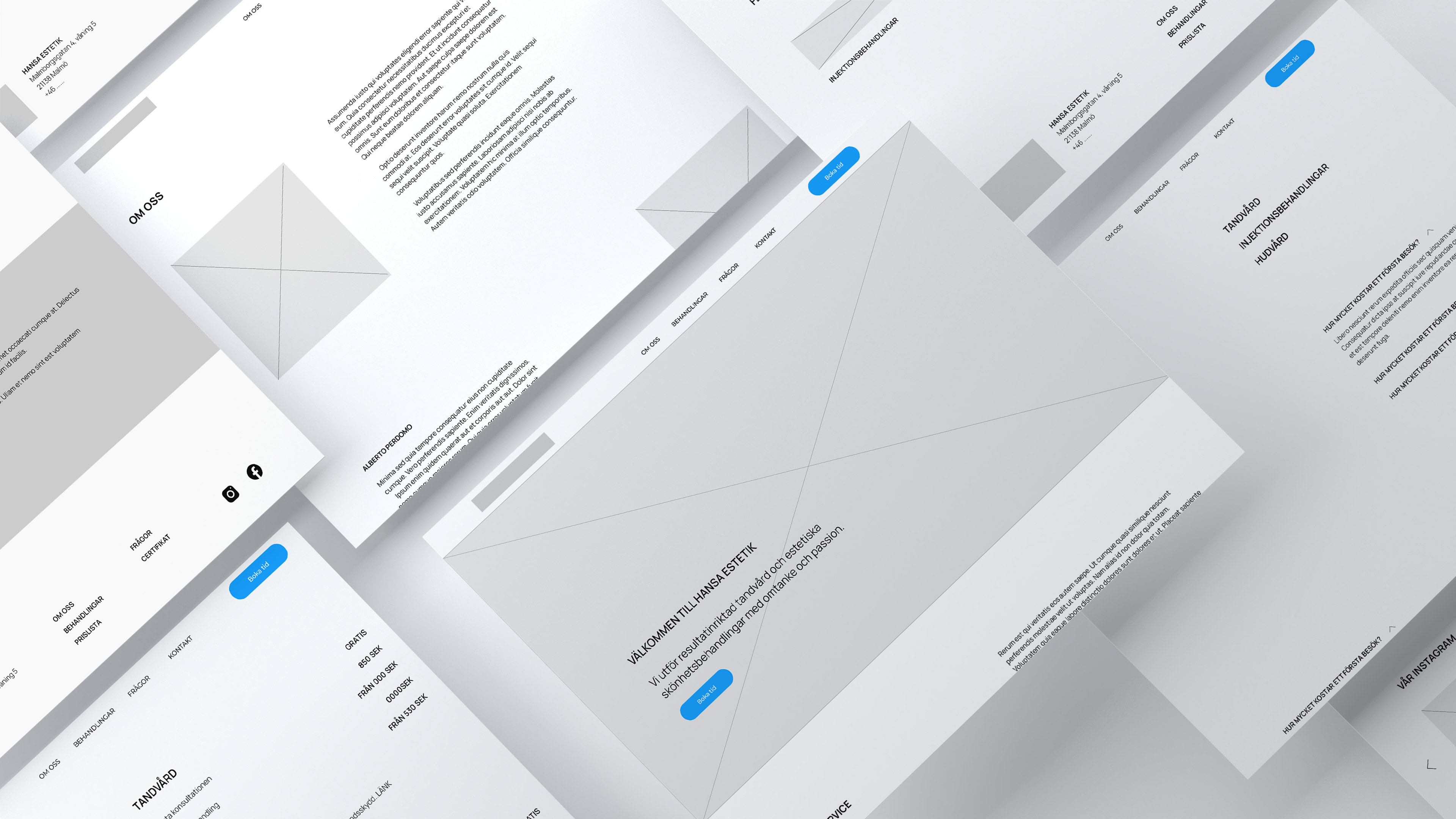
The final LoFi-wireframes
To achieve the desired aesthetic, I drew inspiration from established Swedish brands like Acne Studios, Caia, and Byredo, known for their elegance and timelessness. I utilized a Squarespace template as a foundation, enhancing it with custom code to meet the project’s specific needs and elevate the overall user experience.
The resulting design captures the timeless elegance that the space craves while ensuring an intuitive and user-friendly experience. This project not only allowed me to explore my design capabilities but also deepened my understanding of creating meaningful digital experiences in a healthcare context
SEO-implementation and Hotjar
Creating a modern website requires staying up-to-date with analytical tools and SEO best practices. I focused on optimal paragraph length, site-wide content, and keyword usage while also adding descriptive titles to all images to enhance web accessibility. To boost search engine rankings, I researched competitors, specifically clinics and healthcare providers, to identify high-traffic keywords. By integrating these terms into the SEO site description, the site’s average Google search ranking improved from 8.6 to 2.1 in just one week.
For in-depth visitor analysis, I installed Hotjar, an advanced analytics tool that tracks user behavior, such as scroll depth. The data revealed that 50% of visitors dropped off after the first fold, suggesting a design issue. Initially, I had used a slow, site-wide “fade-in” animation to create a minimalist, subtle aesthetic. However, the heatmap showed that visitors might be uncertain about additional content further down the page. Recognizing this, I replaced the animation with a static design. Within 24 hours, user engagement increased significantly: 75% of visitors now scrolled to the bottom and interacted with the call-to-action (CTA) on the landing page, confirming the design adjustment’s effectiveness.
Scroll behaviour with enabled side-wide animation.
Scroll behaviour with disabled side-wide animation.
