CLIENT Freelance business (2022)
WORK AREAS Brand & Visual Identity, illustration, web design
SOFTWARE Adobe Illustrator, Adobe Photoshop, Adobe Indesign, Webflow
How to brand your own business?
In my journey to develop a brand identity that reflects my playful spirit and love for color, form and craftsmanship, I drew inspiration from my passion for materials and photogenic aesthetics. I aimed to express this passion through organic shapes and my favourite colors.
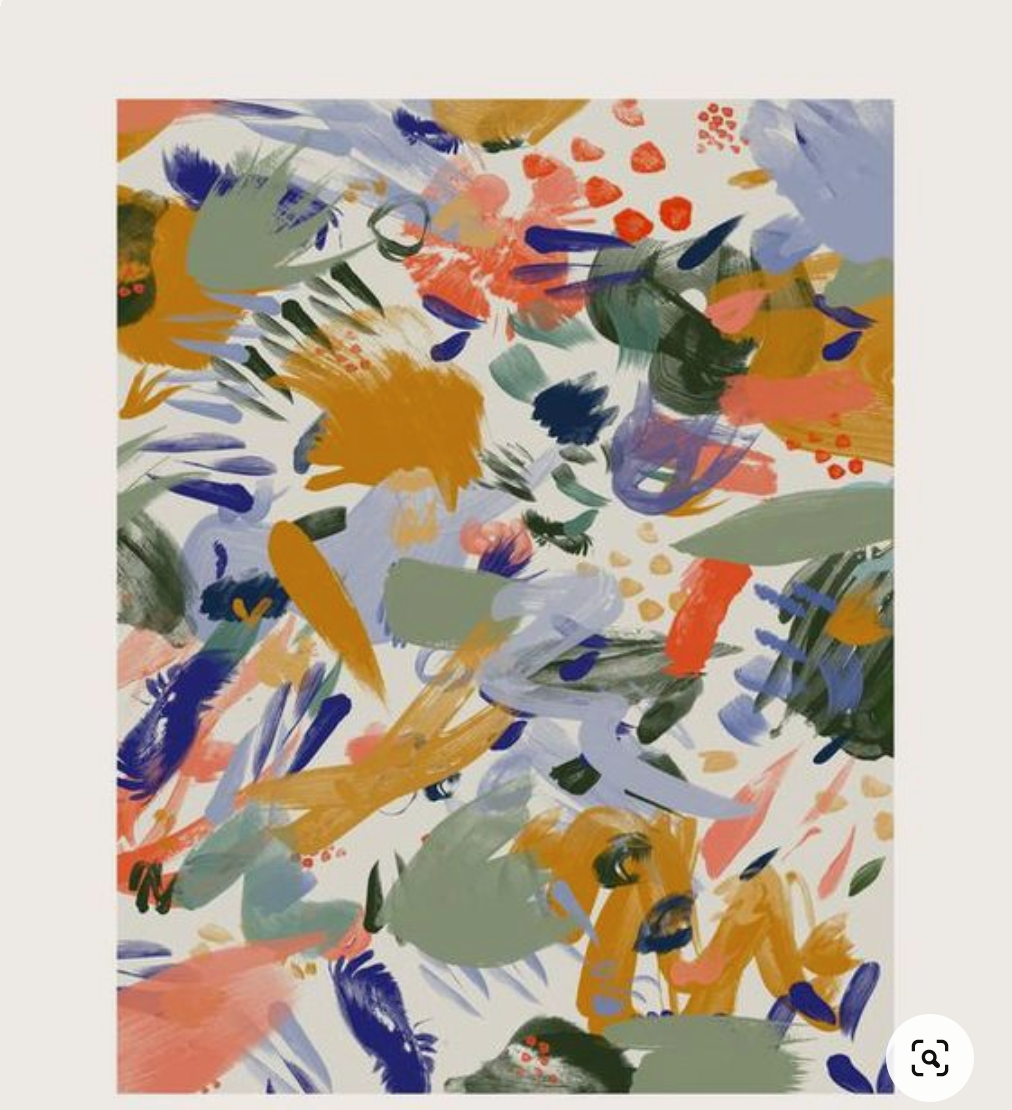
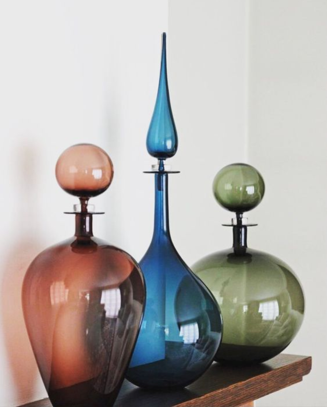

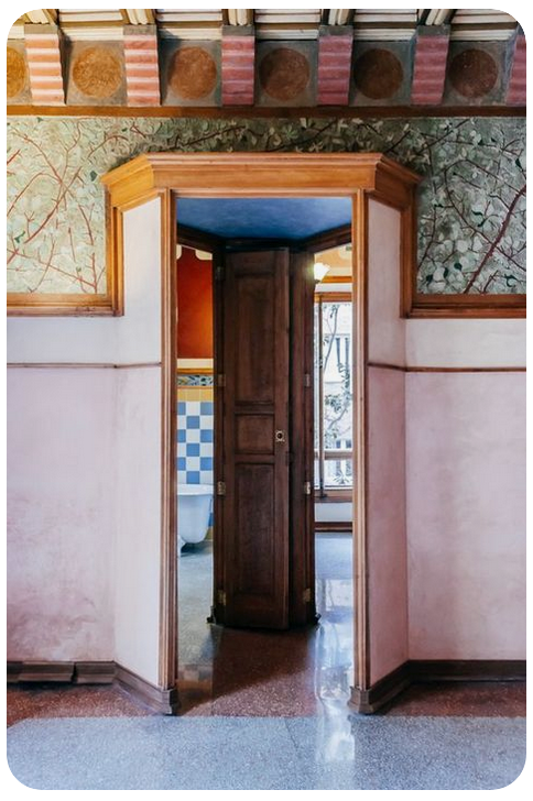
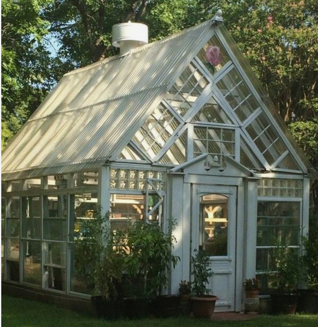

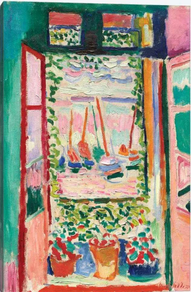
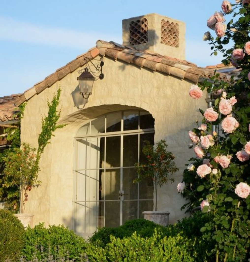
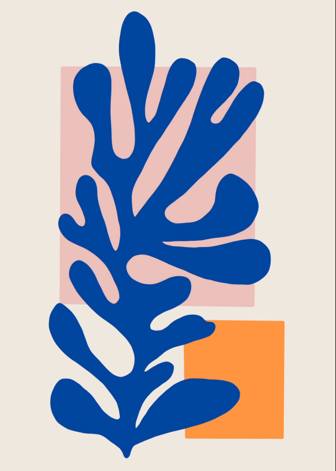
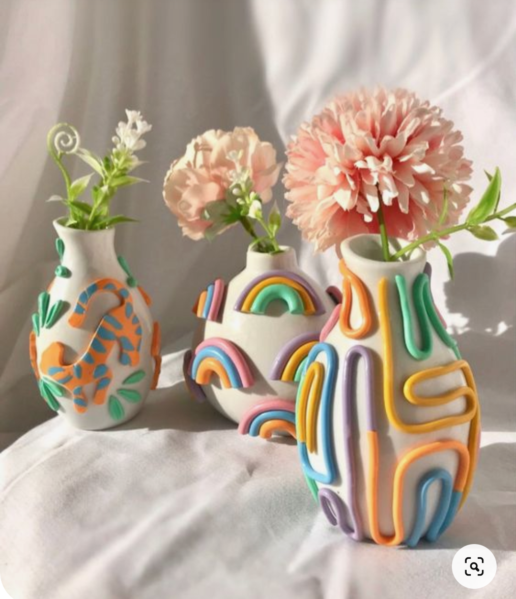
This moodboard set the tone for my choice of color and shapes for ity design's visual identity.
At the outset of my design career, I chose to adopt an alias rather than working under my own name. Being rooted in the world of literature and storytelling, I have a love for old, almost forgotten language. I therefore researched Old Swedish words that have fallen out of use and settled on “ity,” meaning “therefore.” This not only reflects the clarity of my work but also serves as a playful nod to the designer’s perpetual quest for the “why”.
The graphic elements for ity design's visual identity
The color choice was simple: my favourite flavours and shades that summer 2022. Since this visual identity was something very personal, I opted for a typography that respresents some of my character trades: feminity, smoothness and openness.
Those attributes are being transported into two organic blobbs that shape the logo. The colors Poppy and Pistachio are building a contrast to the soft background gradient and make the logo pop.
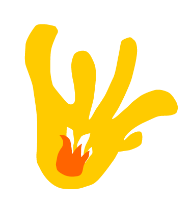
It was important to me to translate that feeling of passion and creative drive that excites me in my work. I therefore illustrated a flame – which also resembles a hand – as a symbol for my craft.
While nowadays opting for muted colors in my portfolio to allow projects to stand out, a central element remained: the flame. As my logo, it also resembles a hand, symbolizing my fervor for design and creative expression.
